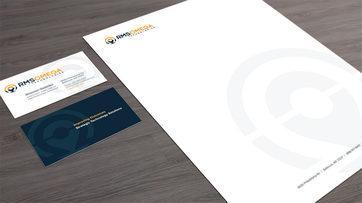
Branding
RMS Omega was looking for a refresh. Their logo was stale and tired and needed some kick. One of the things they wanted to incorporate is the concept of geo-targeting. Why, because their business is to track inventory and pretty much anything else you can think of.
We also developed a handful of division/product logos. To keep the family feel we leveraged the same font as the corporate logo and contained the marks within a circle.
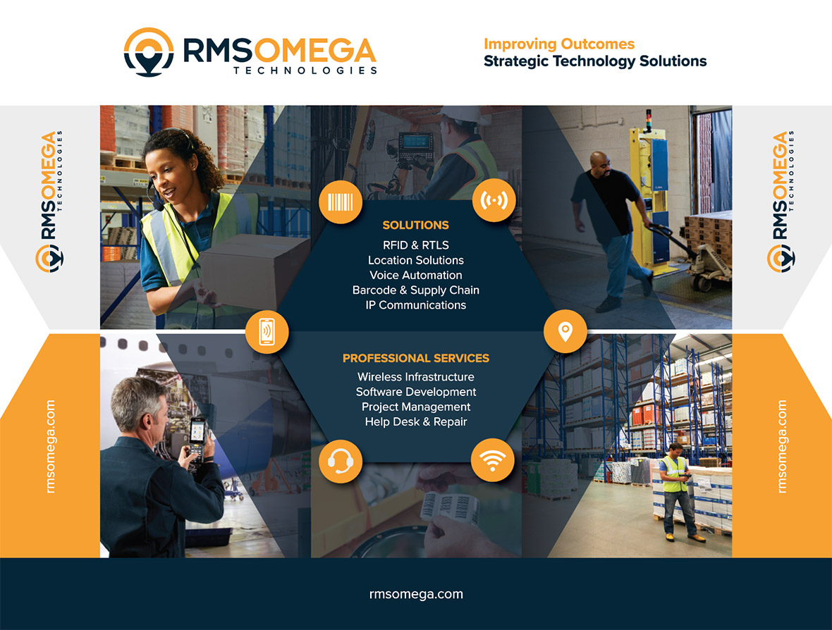
Exhibit
RMS needed a standard 8×10 booth but it was important for the imagery to specifically target the tracking services they offer.